First, a few things from me: Photographing can be a daunting task, especially when we know that the photos have a huge influence on whether a potential customer checks out the item, or even decides to buy it. Images speak louder than words; that makes them even more important than a well written description to get someone to "enter the door" to your shop. No pressure!! :P
On Etsy (or any other online shop, for that matter) image is a small thumbnail mixed with many other images. You definitely want your image to stand out! Remember, not everything needs to be show in the first picture - it just needs to be enough to get them into your shop. You have 4 other pictures to help give more detail if they are interested in a purchase!
Here are some of my favorite "awesome photos" (shown in thumbnail size) from our fellow team members! I'll tell you why I like them:
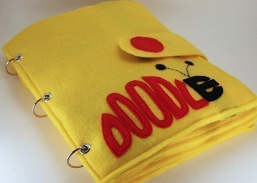 Doodlebug - ePattern for a Portable Art Book from CopyCrafts shows the item at a cool angle. You can read Doodle really well and it just makes me want to see more.
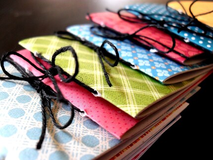 25 Assorted Party Favors from CinderLisa Design are SO different from the background - the little books really pop! They look absolutely beautiful, they are very well presented.
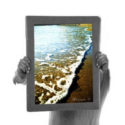 Warm Surf by HolmesTP is incredible! I know he's closing his shop, but this guy presents his photos so well in a photo! It's cool that the item for sale is in color, and the rest is gray or bright white.
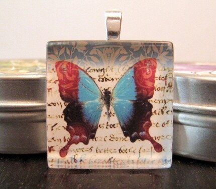 Red and Blue Butterfly on Writing for sale at My Daisy Dreams is in front of other items, but they aren't distracting. You're shown a beautiful butterfly, and it makes you want to see what's written behind it.
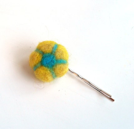 Lily - Felted Flower Bobby Pin by ShellAnne's Splendor is great! This tiny item is bright and colorful, which is great against the white background. A white background keeps it playful - if she'd chosen a black background, it would seem too serious, and anything with color or a pattern would have detracted from the flower itself.
Well, I hope that helps for those of you who have wanted some pointers of what works! Let me know if you have more questions, or want to get more advice on presenting your items in their best way!


Great observations! You can't have too much advice when it comes to photography.
ReplyDeleteI read through this article and found it very helpful. I just opened my shop back in December and I feel like I still have SOOOO much to learn. I appreciate any/all information on how to improve. Thanks for the article.
ReplyDeleteNow, if I could just figure out how to get my camera to do just what I want . . .
Melanie